Creating a Book Cover: Castrating Venus & Other Design Challenges
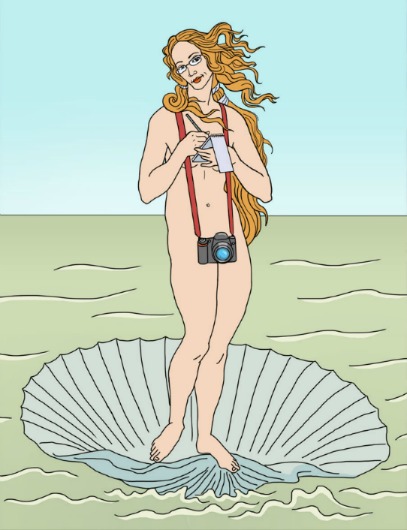
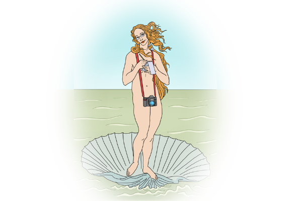 I explained the genesis of my book’s title, Getting Naked for Money, and how I finally got up the nerve to go for the name in an earlier post. In brief, a photographer friend came up with the concept of having Botticelli’s “Birth of Venus” reincarnated as a reporter on my book cover. Nudity was now artsy and classy — and it would be clear that this was a book about a journalist, not a hooker.
Now all I had to do was find an artist to make it a reality. Easier said than done, right?
Not in this case.
JT Morrow: Art parodist par excellent
I browsed some illustrator websites and found JT Morrow, one of whose specialities is creating parodies of famous art works. I loved what he did but he had big corporate and publishing clients. I was sure he would be too busy — and out of my price range.
There are some days and some occasions when I wouldn’t have even ventured to ask. But he was so perfect I had to try.
To my surprise, he said he’d be able to do it on my schedule, and at a price I could afford, with one very reasonable caveat: I can only use the image for the Kickstarter campaign’s mock up book cover. That’s one of the reasons I need to raise money through a Kickstarter — to pay for real talent in art and book design.
And so we began the process of collaboration.
Round 1: Venus as a journalist
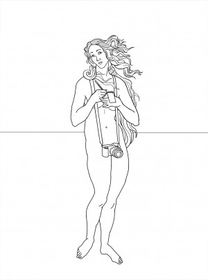
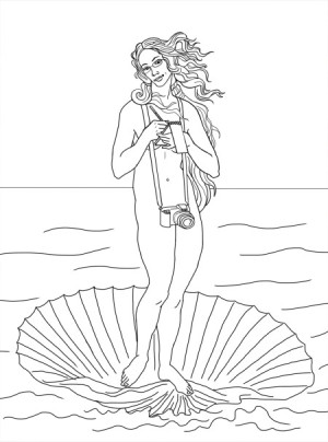
Once we established the basics, that I wanted Venus to be a journalist, as indicated by a notebook and camera that would also cover up the naughty bits, I got the first round of sketches.
- Venus 1
- Venus 2
- Venus 3
I chose Venus 2 because, if we were going to mess with Botticelli, I wanted to keep the original image as recognizable as possible.
Round 2: Venus gets glasses
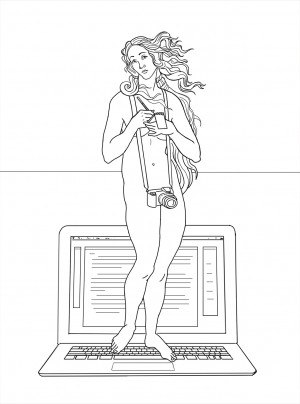
I wanted Venus to look less ethereal, more intellectual, and also to look slightly uncomfortable with the situation she finds herself in, i.e., trying to do her job in the nude. I suggested glasses as a possibility and also messy hair.
- Venus 4
- Venus 5
- Venus 6
- Venus 7
I liked the glasses. The messy hair (Venus 7) not so much.
Round 3: Venus’s notebook gets larger
I chose Venus 4 (or 6; I can’t see the difference between them now — can you?), but said I wanted her notebook to be larger: A real reporter’s notebook, which I always use for taking notes. Here’s the result.
 Round 4: Venus gets less angry
We were close, so close, but Venus’s expression wasn’t quite right. I had wanted her to look uncomfortable and a bit embarrassed, which meant her eyes were looking off to the side, but then I got feedback from Laura Kelly, the brilliant designer of Freud’s Butcher and this site. She had agreed to do the mock up of the book cover, and loved JT’s image but said that Venus’s eyes needed to look directly forward in order to engage the reader. And when I passed this suggestion along to JT , he agreed, and added that maybe Venus should also look a bit friendlier. I wouldn’t want my readers to think I was angry with them.
And so I had to choose between the next two:
- Venus smile A
- Venus smile B
JT liked smile B. That was a bit too happy for me. I chose A.
Round 5: Venus’s camera has to be castrated
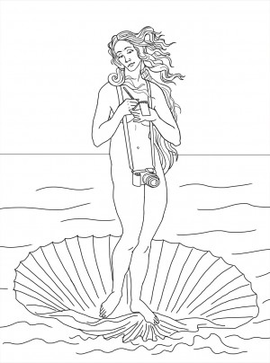
Laura loved A too but then pointed out something I somehow missed: That Venus’s camera looked very phallic.
I did not want a Venus with a penis. But we were almost at the end of the process, already working on the color. J.T. came up with the illustration you first saw at the top of this post — camera lens intact, just seen from a different perspective.









1 Enlightened Reply
Trackback • Comments RSS
Sites That Link to this Post