Book Cover Bingo: Venus Hits the Beach
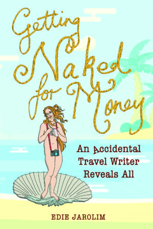
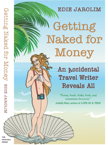 And here it is, the final version of my book cover, or at least the front. One of the great–and scary–things about publishing a book yourself is that you have control over every aspect. Like the book soon-to-be within it, the cover underwent many revisions–though not ten years worth, happily.
My Cover Girl, Venus
In Creating a Book Cover: Castrating Venus and Other Design Challenges, I detailed the genesis of the central illustration of my book cover, the reincarnation of the Birth of Venus as Journalist on the Half Shell. (In case you’re wondering about the post title and don’t want to read the whole thing, at one point the camera looked extremely phallic.) I have grown extremely fond of my classical alter ego, created by the very talented JT Morrow.
When it came time to create a Kickstarter campaign, I needed a quick mock up of a book cover. This time it was the very talented Laura Kelly, designer of this website and Freud’s Butcher, to the rescue.
I really liked this rough draft version, and lived with it for more than a year. In fact, I thought it might be polished and used as the final cover, but worried a little about the faded typeface of “Naked.” And though the treasure map parchment was appealing in its evocation of adventure, it alluded to the past, not the present.
I decided to explore other options, while keeping this original as a strong contender.
Enter SpikyShooz.
My British Book Cover
Through a happy misunderstanding — and Brexit, which brought a dollar/pound exchange rate favorable to the U.S. — I found a cover designer in the UK. Working with Shona Andrews, a.k.a. Spiky Shooz, was a far better experience than working at Rough Guides in London. But you’ll have to buy my book to read about that.
Why did I choose someone so far away?
First, there was her logo:
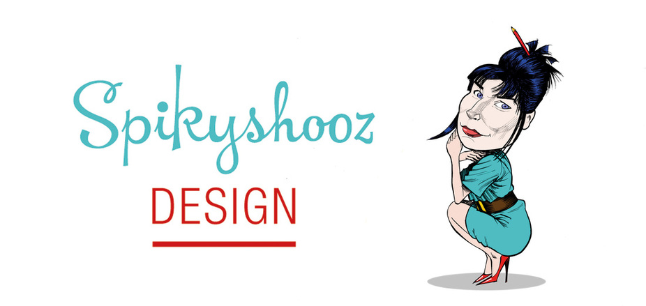
It was fun, colorful, and had lots of moxie.
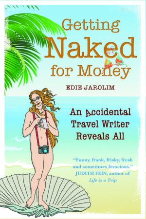
Then there was the fact that one of her book cover clients was Barbara Kingsolver, long-time Tucson resident and famous author. Never let it be said I’m superstitious, but I took these things as a sign.
Take 1
With the caveat that these were not high resolution images (aside from Venus), I got a taste of Shona’s style with this first take. She had me at the falling over “A” in “Accidental.” I loved the whimsy, and I also liked the beach scene. It was fun and contemporary — and reflected a couple of key chapters in my book: I wrote the Complete Idiot’s Travel Guide to Mexico’s Beach Resorts and had a fling at a beach hotel while on assignment for Brides. The main title script was a little hard to read but I liked the handcrafted sandy feel of it.
Take 2

The smaller, more vivid palm tree on the other side was good–less busy. But the typeface was still a little hard to read and zapped Venus in the head. Plus, in the meantime, I’d gotten a book blurb that would be perfect for the cover. There needed to be room for that.
Take 3
Almost there. The bathing suit top hanging from “Naked” cracked me up. But I knew it would be hard to read in a thumbnail. And the word “Naked” was a little TOO big. I thought the subtitle and the title should be together, too.
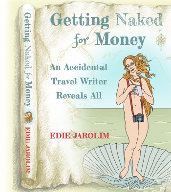
The ragged, unfinished edges were my main sticking point. I really liked them — but I also wanted the book to look more professional, less quirky. In the end, I opted for the straight edges.
Final version? It’s at the top of the page.
Coming next: The back cover and the blurbs.


Love the newest and final version! Interesting to look at the book cover evolution 🙂